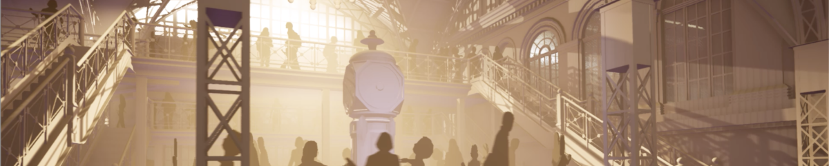
Welcome aboard! My name is Kira, and I’ll be your guide here on this great movie diatribe. It’s the perfect job for me because I used to work in movies! But just between you and me this is no ordinary tour. Because here we’ll be taking a look a film editing techniques and seeing how they can be used to design theme parks and rides! Funky huh? Just please make sure to keep your hands, arms, and eyes in an ergonomic positions at all times.
Now that we’ve taken care of business. Let’s talk about me. Back before I started pursuing a career in themed entertainment design, I had another career ambition. For a very long time I wanted to be a film editor. (Yes ironic for a person who can’t cut anything out of a 7000 word article). I fell in love with the process of editing when I was a young teenager, went to film school, and had a fairly successful career working in all stages of the post production process – editing quite a number of short films, commercials, and a feature along the way. As such, I spent a lot of time studying editing theory and how, not to craft stories from scratch, but how to tell stories with existing pieces: spending a lot of time thinking about how to shape emotion through the use of pacing, perspective, music, etc. And as such I can’t help but approach the design of themed entertainment from within this framework. But it’s occurred to me that this might be a more novel perspective for many people interested in the discipline because while modern theme park design has its roots heavily planted in movie making – most current fans and people interested in designing it tend to have roots more in visual art, writing, technology, or general theme park fandom.
And I know what you’re thinking. “Editing? How is there any editing happening in a theme park? It’s all just one continuous environment!” To which I’d reply, “Well, only sort of.” The rules and theories behind editing actually apply to any sort of art form that’s experienced over a period of time. Editing is the study of how to best tell a story. And when you look at themed attractions in particular, there’s actually a lot of tools being used in ways remarkably similar to cutting together film. So what do you say? Is everybody ready?
Continuity Cutting
One of the first things you learn in any editing class is the style of editing known as Continuity Cutting. It’s one of the two major editing styles that all storytelling in movies can be reduced to. It’s a style that originated way back when – shortly after the dawn of cinema – and reached its zenith during the studio era. This is an editing style that prioritizes the illusion of a single uninterrupted chain of events from beginning to end. It’s a cutting language designed to seamlessly bring the audience from one environment and scene to another. You start off with an establishing shot of the location: a big wide shot of the Himalayan Mountains let’s say, and then you get a bit closer – with a wide shot of a shrine at the base of the mountains. A figure enters the shrine. We cut to a wide shot inside the shrine where we match action of the figure walking inside. We can see this is our leading man; he approaches another guy. The camera cuts to a 2 shot. Then over the shoulder. It switches back and forth from each characters perspective as the perspective gets closer and closer. Medium shots, then close ups right as the action is at its peak. And then we reverse that progression, usually a bit quicker, as the scene ramps down until we’re wide again and we fade to black, dissolve to the next establishing shot, etc. The action of the scene matches how close we are to the scene. The cutting style gives us time as an audience to realize where we are, and slowly bring us into the environment and naturally get us to the series of close-ups where we can see the actors full range of emotions in time for the emotional part of the scene. And it prioritizes the illusion of reality.
This style of editing, while it’s evolved over the years, is still the very foundation for how nearly all of narrative cinema today is constructed, especially in America and that’s because it works. It’s a natural way to navigate a story. Think about the Himalayas again – if I were to create an attraction, say I don’t know, based on an expedition to Everest I might want to start off with a really wide establishing shot. And Expedition Everest does exactly that – the mountain is placed in such a way that you see it coming from very far away in a series of perfectly composed shots – each one layered with story beats – starting off vague and then, as you get physically closer, the detail starts filling in. The shrines and museum, the train station, the train car, etc. And this pattern repeats for each scene. When we’re in the heat of scene 1, boarding that train, the mountain is all but invisible. And so once we leave the station, the scene is over, we immediately cut back to an establishing shot of the mountain again, and so on and so forth. Such an approach is a natural way to match the visuals with the content. Notice also that it completely preserves the illusion of a continuous reality – every scene, every vista, flows naturally into the next as one continuous environment. At no point do you knowingly enter a show building, at no point is there any real demarkation between the land and the ride, or between each scene, or any unnatural jumps in time or location. Unlike say in some classic dark rides where you might change location frequently and without establishing shots or diegetic transitions. And usually there is a very clear boundary between the facade and interior of an attraction. This is not to say classic dark rides don’t employ some elements of the continuity style, most attractions tend to in one way or another, but they’re not as firmly attached to it as many newer attractions. Which is an interesting shift. In movies and tv since the height of the studio era we’ve actually seen a gradual loosening and many variances away from and in addition to the pure continuity style – with many modern films playing fast and loose with time, location, intercutting, and adoption of the principles of montage (more on that soon). But in the theme park world we’ve actually seen a move towards a much stricter interpretation of continuity style and away from more abstract storytelling elements. Much of this comes up in the discussion between traditionalism, presentationalism, and new traditionalism as discussed here on the blog and by David Younger in his book Theme Park Design
Montage Editing
In contrast to continuity is the concept of montage – a style originating largely in Russia. It’s a technique that proposes that the relationship that occurs in the contrast of images is more meaningful than the information contained in the two separate images. Now keep in mind that when talking about montage editing, we’re not merely talking about montage sequences in movies (when a bunch of events tend to happen in quick succession often with a music track). Montage is specifically about the technique of using images to create associations. Often this is where the discussion of the Kuleshov effect comes in: a classic demonstration of the power of editing. You take the same shot of a neutral faced actor and intercut it with a bowl of soup, a child playing, and a coffin and audiences will in turn see the emotions in the actor of hunger, sentimentality, and grief. Montage relies upon the human brain’s inherent desire to recognize patterns in noise to create meaning: a strategy that tends to be used more often in some older attractions and is most useful for communicating story nonverbally. For example, Disneyland’s Pirates of the Caribbean is essentially one long series of only tangentially related tableaus – particularly in its first half – and it relies on the audience to construct meaning, theme, and story from that. Montage can be particularly engaging because the brain is more actively involved in putting the pieces together. It also gives the creator the ability to create a message that is more than the sum of it’s parts. Drunk pirates playing around with explosives, drunk pirates pillaging a town, and drunk dead pirates unable to enjoy their treasure, are on their own each entertaining, but when juxtaposed together create a morality play subtext. I’d argue montage, used in the context of theme park attractions, encourages rerideability and is a form of passive interactivity as the lack of specificity can make an attraction or sequence seem to have more depth than it would otherwise by encouraging multiple interpretations, and requiring the mind to observe, be present, and engaged to draw conclusions. Presentational attractions often used montage at length – creating entire stories told in the abstract rather than concrete – such as the renaissance and dawn of electric communication scenes in Spaceship Earth, or the looking back at the future segment of Horizons. Montage can also be used more subtly in attractions to effectively communicate ideas that might not be able to be staged. For example in Dinosaur, security cam footage of the Igauondon along with our reflected image in a mirror that’s part of an unrealized effect, still communicates the idea that we brought the dinosaur back with us.
Montage can also be found in Forensic storytelling – a concept detailed at length by Ian Kay and common in themed spaces. In this case instead of juxtaposing shots, scenes, or beats, designers can juxtapose objects to create stories merely by controlling the subtleties of their staging.
Both montage and continuity styles are found at the edges of a spectrum of ways to tell a story: each with benefits and drawbacks. Ideally each are used when appropriate to tell a story in the best way possible for that story.
Motivated Cuts
This is a principle in editing that reasons that you only cut when there is a reason to do so. You don’t change the angle just for the sake of changing the angle. You do it because you want to see a reaction, or you want to see what a character is looking at, because the scene is getting emotional and you want to see the actor’s eyes, etc. There needs to be a dramatic reason. In attractions this same rule can apply. In theory, the vehicle shouldn’t spin, there shouldn’t be a lighting change, none of the transitions listed later on in this article should be used unless there’s a dramatic justification. And if for some reason it is required for a technical reason, then a dramatic reason should be created. See the stretching rooms in the haunted mansion being invented to justify elevators, or the story beats around the lift hills in Space Mountain.
The 180 Degree Rule
One of the classic rules used in filmmaking, originating in the era of continuity cutting, is the rule of the line of action. In any scene, an imaginary line is drawn down the set and the camera always stays on one side of that line. If it were not to, then your actors would be facing one way in one shot, and a different direction in another shot. In practice the line can move around a bit throughout a scene, but in general you don’t cross it. Unless you want to use it as a tool. Crossing the line in filmmaking is often reserved for a specific emotional moment, or important beat of a scene to subconsciously indicate a change, usually of the unsettling or disorienting kind. And attractions can and have used this in the same way. The best example that comes to mind is in the Haunted Mansion, where we have a literal 180 degree turn around a scene. We enter Madam Leota’s seance on the right then circle around to see her from the left, a literal shift in perspective, and I don’t think it’s any coincidence that that is the moment we begin to see the spirits actually materialize. We see the spiritual ether only after crossing the line, and the scene immediately following this is the ballroom – in which we see ghosts for the first time.
But of course in themed attractions and environments there’s many more ways to change perspective besides crossing the line of action. For example, later in the mansion, despite having already navigated several hidden height changes throughout the ride, when we exit the attic we are brought down a level lower and intentionally tilted back to make us notice. And when we reach the graveyard, the spirits have again gone through a phase change: no longer ghostly, but fully material. Similar transitions in perspective to signify important story beats happen in Pirates between the bayou and grotto (or in Florida between the grotto and main show), in spaceship earth between the past, present, and future, and to remarkable effect in the Tower of Terror when our elevator decides to move forward.
Transitions, Rhythm, Pacing
Speaking of transitions – they’re hugely important! In film the most common transition is the simple cut, and it is through these cuts the overall pacing and rhythm of a story is constructed. The cut is the basic building block of filmmaking and through cuts you create rhythm. Pacing and rhythm are at the heart of the telling of all stories. It doesn’t matter how good everything else is – if a story isn’t paced properly, if it’s not told with right tone, intonation, and rhythm it will fall flat. Or worse, not even make sense. Rhythm and pacing allow the plot to rush, eb, and flow – allowing the space for human emotion. Karen Pearlman wrote an entire book on the subject called Cutting Rhythms, based on her experience of dance as applied to storytelling and editing and it’s a fantastic read about how energy flows – which we’ll get to more detail on in a bit.
Transitions can also be used to communicate ideas about the flow of story. For example dissolves in film have historically been used to indicate a passage of time or a character having a memory or dream. Fades to black can have similar functions to act breaks in theatre..
In themed entertainment, transitions are even more important than they are in film – because in the built world everything is physically a continuous environment: everything is attached or next to something else. And so it is through a wealth of transitions we can create pseudo-cuts, dissolves, and begin to shape the story we’re telling. Rhythm and pacing are crucially important. Much of the editing process is spent getting the timing of every single shot perfect so that it matches the performances and emotional needs of the scene. These aspects of design in themed entertainment contribute much to the final experience of a ride or land. For example, Mr. Toad’s wild ride feels frenetic and well, wild while Peter Pan’s Flight is positively lyrical despite both attractions taking up roughly the same amount of space and ride systems which move at similar speeds. But the latter only features a handful of scenes that each dwell for a while, while the former throws a good dozen or two at you in the same period. The former has track with smooth curves that move you within scenes that fade and flow together while the latter has tight turns that whip you around and thrust tightly contained scenes upon you before you can catch your breath. These transitions and their spacing affect the overall experience of the attraction.
Actual Cuts and Dissolves
First, I’d be remise not to mention that there are direct equivalents of cuts and dissolves used in the themed entertainment world – usually in land and park design rather than attraction design. Much has been written about the transitions between lands within Disney parks, enough that this is typically what “transition” is even used to refer to when discussing themed entertainment design. These transitions are often created through the use of a nearly literal “dissolve” at the land boundaries – where architectural styles, railings, pavement, color, landscape and more all subtly change and blend together. Much has also been written about how in Disneyland (and many other parks not of the Disney and Universal variety) these land transitions are more akin to cuts because the transition happens so abruptly. There’s also a natural equivalent to a cut that occurs any time you enter or exit a building and the environment quickly has the opportunity to change. These are all fantastic examples of transitions, though there’s not much I can say additional about them. Further, when compared to how I’m using the term “transition” these are in some ways more overall strategies that can apply to any transition rather transitions in and of themselves. With that in mind, let’s move on to more specific transition techniques.
The Blind Curve
In themed entertainment there’s a plentitude of types of transitions: many more than typically used in movie-making. But if you had to pick the basic building block, the blind curve would be a pretty good choice. Interestingly I wouldn’t say this is akin to a cut – it is more akin to a dissolve when you think about how it affects the audience – but it by far is the most common way attractions and lands both are constructed to selectively hide and reveal the next scene, or beat. Don Carson wrote a fantastic article about the particulars of this approach – but essentially the track or path is blocked by some object, so it curves out of the way behind something else effectively hiding the next scene until it reveals itself. In this fashion, blind curves are effective at demarcating scenes. Though their weakness can be that the pacing of the scenes may be entirely dependent on track layout – which often has other considerations to worry about.
Bridges, Tunnels, Under and Overpasses
Similar in experience to the curve, lands and rides can also make use of underpasses, overpasses, archways and tunnels – often going hand and hand with forced compression. All of these can block your view of what’s ahead – and they’re particularly effective when you don’t have the luxury of tight turning radii, or need to keep traveling straight, or have a large environment you’re trying to break into smaller pieces. Forced compression is when you take the audience into a tight, perhaps claustrophobic space, and then you take them into a larger space afterwards. Generally this is used to make the larger space seem larger than it is – but it’s also a very effective transition – a transition that comes with an inherent emotional component of tension and release.
Use of bridges and underpasses and such is also one way to create portals and layers of stratification (I believe a term coined on Passport to Dreams). This is sort of a non-transition transition – perhaps used in conjunction with a curve. Essentially, instead of blocking the next scene, you let it be visible in a frame and have it beckon you forward with curiosity. This is a great way to have scenes that seem to flow together without clear boundaries. This also might be considered the visual equivalent of a J or L cut – a term used in editing when the visuals or audio of the next scene transition before the other. Such transitions are “smoothed” as its unclear exactly when one scene ends and the next begins.
Level Changes
Similar to this is the use of elevation changes. This can be a gradual change – such as with a ramp, or more sudden such as with a staircase or elevator (in rides also drops or lifts). When a scene is on a different level, either above a ceiling, beneath a floor, or with the ramp blocking it, it means that it is completely blocked from view and can be used as an element of surprise. The various methods of changing a guests elevation give quite a bit of control over the ability to naturally control the pacing. The only real downside is that building up or down tends to get expensive quick.
Crash Doors
Another common transition in attractions, especially classic dark rides, is the use of crash doors. Or in land design – just actual doors. This is probably the transition that shares the most in common with the cut. It’s a hard boundary between scenes that not only enables vehicles and scenes to be closer together without being seen or heard, but offers complete control over the exact moment it will open to reveal the next scene. Of course the downside with this, is that doors often don’t exist in the environments being depicted inside an attraction – and if realism is something you’re going for this could present a problem. Some ride systems, such as omnimovers, don’t really allow for the use of doors either. But they can rotate which brings me to…
The Swish Pan
The swish pan. Or vehicle rotation. Most of the rest of the rest of these transitions are just applicable to rides. These days many ride systems can turn the vehicle to face any direction – which in some ways liberates the design of the space from the pacing of an attraction – as you can, to a degree, construct each scene however you’d like, connect them in any way you like, and keep the vehicles pointed at the subject matter until you whip them away to look at the next scene: the swish pan happening so fast as to not even really notice whatever border is between the two environments. This is often used in mixed media attractions to go between screen and physical scenes. Of course the benefit of these vehicles too is that the speed of rotation is controllable – so you can slowly turn the vehicle as one set transitions to another. So the vehicle rotation can kind of function both as a cut or a dissolve depending on what you’re after. Perhaps you want your audience to feel whipped around frantically from environment to environment as in The Amazing Adventures of Spiderman. Or maybe you want them to slowly spin as they’re immersed in 360 degree scenes as in Pirates of the Caribbean in Shanghai.
The Rack Focus
Or how about a rack focus? This isn’t traditionally used in filmmaking as a transition but it absolutely can in ride design. A rack focus in camera work is when the focus of the camera changes between the foreground and background. In ride design a similar effect can be achieved through lighting – a dastardly simple way to direct the audience’s attention, not just within a scene but between scenes. Light the foreground scene, and don’t light the next scene, and even if they’re both in full view of audience the whole time, the audience probably won’t even notice the next one until it’s illuminated. The Universe of Energy used this a lot, as its scenes and vehicles were so large it was difficult to block anything. It’s also used to pretty good effect in Dinosaur and sections of Imagination, lots of walkthroughs, and to utterly brilliant effect in Kongfrontation – where the helicopter spotlight blocked the view of the upcoming scene. Use of lighting to transition again comes with pros and cons though – on the plus side it frees you from layout restrictions, and is relatively natural looking, with any pacing you choose. On the downside – it only works if your vehicles are far enough apart you can have two scenes next to each other and only need to light one. Though this can be addressed somewhat. In some cases attractions will use an almost literal rack focus just through careful staging of the foreground and background. For instance, in Pirates of the Caribbean the pirate with the cats and the burning town are both entirely visible at the same time. But because the pirate and cats are in the foreground and closer, and because it’s them we hear better, we naturally focus on them until we pass.
Fade to Black
You can also use a literal fade to black (or another color). This was most common in presentational attractions, such as Horizons and Spaceship earth (Haunted Mansion uses it too!) – but nonetheless very effective. Essentially between scenes you just have black space, or in Horizon’s case some fancily lit walls. If your level of detail is such that it naturally fades out before the blank spaces, it can seem like a natural pause. This of course is easier in presentational attractions because they have no need to diegetically justify it.
Launches
And finally there’s launches where speed is used to transition you – kind of a linear version of the swish pan – sometimes used in coordination with an elevation change or tunnel. In these cases, scenes are separated by a large distance and that distance is what’s used to block views and control the pacing. This is another one of those transitions that comes with an emotional reaction baked right in, but it is a pretty specific emotion that’s not always appropriate. And anything traveling at a high speed therefore requires a large amount of track, etc.
And that’s just a few of what I’m sure are countless kinds of transitions that can be used to shape a themed experience. Choosing the right ones is such an important part of crafting the overall experience of an attraction or place. The transitions you use determine how closely scenes can be placed, how fast you can move between them, and the visceral feelings within the audience. They are the fundamental buildings blocks of your pacing and rhythm and flow – which build into tone, emotion, and all the other things that make great storytelling. And speaking of flow, let’s talk about eye movement.
Eye Movement
Walter Murch is an editing legend, and in his book, In the Blink of an Eye, talks a lot about this – and goes much further into the psychology of blinking and how that relates to pacing. But his talk about eye movement, along with Pearlman’s talk of energy flow I think are both critically important to understanding how to tell a story environmentally – especially in the case of land design, where you don’t necessarily have the assistance of a ride vehicle or lighting to help you. Some of this relates to the idea of mise-en-scène as well – more or less the overall composition of an image and how the design of objects and characteristics of that image relate to the composition. Humans process sensory information from the world in specific ways – we follow other people’s gazes, we have directions we’re accustomed to reading in, we follow lines and arrows – and these theories are an attempt to utilize that to the storyteller’s advantage.
I think the easiest way to explain this is through use of an example. Imagine you’re designing a ride with a horizontally moving ride vehicle – like Nemo or Horizons. Which direction should the vehicles move? There is of course no right answer – and sometimes the space is going to dictate that for you. But in most of the western world we read left to right, naturally looking right for more information. So if the vehicles move left to right, that would replicate that, whereas if the vehicles move right to left that would create a different feel. While I have no studies to back this up, I’d suspect that in the former you could expect audiences to continue looking right into the scene to see what happens next. Whereas in the latter your vision would more “attach” to the objects moving past it, follow them to the right, then dart left to see the next thing.
It’s also very important to consider how we as humans follow the eye gaze of other characters. If we reach the end of the scene and come across a character looking back into the scene, that’s going to cause us to want to peer back into the scene at what she’s looking at. And if the scene is constructed in such a way that we pass this character once the scene has passed, that might cause distress as we’re unable to look at what she’s seeing. Conversely if she’s looking the other direction that might cause us to naturally look into the next scene. And even if she’s not directly looking at anything, what we see in the next scene can lead us to the conclusion that she was looking at that object.
Editors use these kinds of techniques all the time to shape narrative and attraction designers can absolutely do the same thing. And you want to make sure that the rhythm of these gazes matches up. If a character looks quickly off screen, you want to cut to the bookcase quickly. Or you want to wait to cause distress. Your choices always matter and have an effect on the tone and story. This is what is being referred to when I speak of such abstract concepts as “energy flow”. All the details of a scene should be constructed and positioned in such a way that they naturally guide the eye next to what the designer wants to be seen, away from what they don’t want you to see, and in such a way as to create the pacing you desire. Lots of characters looking at each other will cause your eyes to dart around a lot more than fewer, or if they’re all looking at the same thing. And leading your eyes to something that doesn’t redirect your gaze can make you feel uncomfortable, or make you feel riveted all depending on the context. And it’s not just character’s gazes and vehicle (or pedestrian) movement that affect what you look at and for how long. Relative scale, perspective lines, color, brightness, contrast, motion within the frame, all of these things have an effect.
Disney’s use of “weenies” is a well known example occurring outside the confines of a ride. In all four of the Orlando parks, the central icon of the park is positioned so that not only is it larger than everything around it, but all the lines of buildings and environment essentially point to it – it’s difficult to look at anything else because everything is designed for it to capture your attention. I don’t think it’s any coincidence either, for another example, that the monorail outside the entrance to Disneyland specifically runs in the opposite direction as the Disneyland railroad. The motion of one is designed to try to balance the other and keep the eyes pointed forward. Or how the vessels on the Rivers of America sail deeper into New Orleans Square rather than away from it – even if it would technically make more thematic sense for the boats to be sailing into the frontier instead of away from it . Such motion would throw off the composition, eye movement, and resultant messaging encouraging you to move into the land. The boats sailing off into the land, towards the horizon, and past a distant curve all communicates the desired theme of the scene, despite it conflicting with the geographical layout of the story world. It’s worth pointing out that when the Magic Kingdom was built in Florida the locations of Frontierland and New Orleans/Liberty Square were switched rather than deciding to run the boats in a different direction. The overall composition and how that affected our eye movement and how that in turn affected our emotional state and the subtle thematic messaging was the more important element to keep the same: the emotion of sailing away into the unknown frontier rather than the literal “text” of the geography. Notably, in Disneyland Paris the sailing direction was actually reversed (and is the only castle park to have it’s river traffic go this direction). I haven’t been able to find any interviews or discussions about why that was the case though I suspect it might have to do with a layout that places the entrance to Frontierland closer to center left, or perhaps a thematic approach that places less emphasis on the distant frontier and more on the frontier town you’re visiting. Or, in what would have been common for the era, a hyper focus on the “text” of the story world rather than overall effect and telling of that story. See how the order of scenes on Pirates of the Caribbean in Paris was rearranged to be told “in order” because that made more textual sense (I cannot find this quote at the moment, but I believe it was in a podcast interview with Tony Baxter). Some like the change, and I don’t think it’s awful by any means, but I think the original way the story is told is much more interesting, engaging to the mind, and tonally appropriate.
Parallel Action
Another editing/storytelling concept used heavily in movie making is parallel action – or the idea that multiple events can be happening simultaneously. Scenes cut back and forth from each other and in this process all the events seem more dramatic. A version of this technique is also seen in many modern musicals, often in the act two closer where multiple stories come together in a dramatic number. Sometimes this is used to show two perspectives of an event, heightening the tension – for instance when a cop show cuts between the people inside a house trying to cover up the evidence, and the police racing towards them. Regardless of the specifics parallel action is nearly always a way to raise the stakes, increase drama, and make the pace faster. Attractions have implemented this technique in a couple of different ways.
One is often through the use of in-vehicle screens. For instance the Back to the Future ride and Star Tours both used/use in-vehicle screens to give additional story information about things happening outside the current audience’s perspective. This is particularly useful in simulator attractions, as our perspective is often restricted to a wide shot of whatever is currently in front of us. By having the supplementary screen in the cockpit, we’re able to see other characters or information (such as seeing behind us) that can add to the drama, or reinforce what we’re being told. The increase in streams of stimuli can also make the situation seem more frenetic.
The other kind of parallel action I’d suggest is when attractions are designed to let you see other ride vehicles going on the adventure. Most attractions tend to be designed so that you can believe you’re the only group having this experience, but when used carefully letting other vehicles be seen can really add to a scene: often making it seem busier, grander, or faster paced. In essence it allows you to zoom out to see the story of the setting. Perhaps the most classic example of this is in the Indiana Jones Adventure – where upon seeing the main temple/lava room we see another vehicle race across the rope bridge (and may see at least one other vehicle as well). By seeing this the scale of the chaos unfolding is rapidly increased. It’s not just us that is facing danger, danger is unfolding around the whole temple. Our view of the situation is moved to a more macro level; the idea that is communicated is chaos. The scale of the room is communicated as well; the kinetics increased. The reveal of this scene without other vehicles would still be impressive – but the tone would be different: implying perhaps a curiosity, or an environment to explore. The pace would be a bit slower. The use of parallel action allows us see beyond ourselves – and in a medium so tied up with the first person perspective – it can be a vital storytelling tool.
Narration
While not just an editing technique, it is often the case that narration or voice over is added to a movie after it is shot to help clear up story beats that might otherwise be unclear from visuals alone. And in the best narrative art, the narration adds a character of its own – contrasting or adding something to the visuals that wasn’t there before. Think of Lemony Snickett. Narration is often especially useful in documentary work where b-roll is often not enough to tell a story in the detail one would like. And it’s no surprise that narration featured heavily in the presentational attractions of Epcot – many of which were essentially documentaries adapted into ride form. Narration is able to take the common threads suggested by montage and literalize them. If it wasn’t clear what the relationship was between a boat and a greek mathematician was, thank the Phoenicians – I mean Judi Dench – to clarify it for us.
Narration can enable the creation of a story where none otherwise exists. Or modify it. The haunted mansion, for example creates a large portion of it’s tone, and ties sections of itself together by the presence of the ghost host. He explains why you’re there and why spirits are materializing. His narration is plentiful in the beginning – tying disparate pieces of the mansion together until the point you get absorbed into the action and he can fade out. Dinosaur uses narration, not so much to explain what’s going on or tie it together (you’re being chased by Dinosaurs – don’t need much more than that) but to add to the frenetic pace, delineate structure, shape the tone, and provide a ticking clock. Dr. Seeker is constantly shouting, upping the ante, and in several cases implying more action than is actually happening – which is another trick narration can pull off particularly well. A vehicle jumping around in the dark can be fun, but when you’re told you’re taking evasive action from meteors it can change the experience. There’s plenty of cases of people imagining seeing things they didn’t, merely from the suggestion of voice over dialogue. The various incarnations of the submarine voyage utilize this to great effect. All you see visually is bubbles, but when it’s said you’re diving a plausible illusion is created. Narration can also clear up story beats that are sometimes just hard to communicate otherwise. One of the less effective scenes in the Indiana Jones Adventure is when the engine stalls – communicated just by a motionless vehicle and a sound effect (or lack thereof) which can often seem more like a breakdown than an intentional effect. If Sala were to be communicating via radio like Dr. Seeker in Dinosaur this undoubtably would be cleared up. In the California version of the little mermaid ride, voice over by Sebastian is used in a transition scene to clear up how we get from Part of Your World to Under the Sea and even though it is a small change, the effect is quite large. This is the audio first version of the L or J cuts mentioned earlier.
One way that narration and voice over operate in attractions that’s different than in film, is that in attractions, generally speaking, a grammatical convention has been established that let’s characters talk to us, even if we don’t see them. Even in otherwise hyper-realistic attractions. Characters in many attractions are basically assumed to be able to be heard no matter where they are via a kind of non-diegetic telepathy. This is actually a pretty powerful tool in the toolbox, as it means story beats can be communicated without needing the space to actually construct the scene.
Graphics
In film, title cards, subtitles, and other graphics will often be used to convey information. In theme parks, there too is an equivalent to this: signs! In film sometimes you’ll swap an establishing shot for a title card with the location. At the entrance to theme park lands you get a sign that says “Adventureland”. In Star Wars you get an opening title crawl, at Disneyland you get a plaque. Signs are a natural fit for the built environment and can offer both story information and useful instruction. Joe Rohde gives a nice spiel about that here. Just like in film, relating information in text form generally isn’t the primary storytelling tool – but sometimes it just get’s the job done.
Music & Sound Design
And finally there’s music and sound design These are topics that deserves their own entire series of books – and I’m sure there’s several out there. It’s not really an editing technique on its own, but it’s difficult to talk about the editing process without at least mentioning all that sound can do. Really sound is 3/4 of the experience of any staged narrative. Music in particularly holds an almost magical ability to completely re-contextualize the mood of a scene, and drastically alter the perceived pace and rhythm of a scene. If you don’t believe me, check out this clip of the opening scene of Indiana Jones and the Last Crusade without music. While I’ll leave a full discussion for another time, suffice to say that music and sound design are integral parts of the telling of any story and using them well should the highest priority.
That’s a wrap!
And that about wraps up this overview. In filmmaking editing is more than just deciding what content stays and which content goes. It’s more than just deciding which performances are best. It is the systematic process by which the entire form of the story is created. It is the art of not the creation of story but that of storytelling. While themed environments and rides are a drastically different medium the principles that govern the telling of stories in film can be extrapolated into the mediums of ride and land design where they find a remarkably good fit. This article is just a toe-dip into the full range of techniques and strategies that can be used to effectively tell a compelling story but hopefully it conveys a mindset that helps in conceptualizing how to think about it.
Now, there’s only one more scene to do…and that’s the exit. When the article ends, don’t forget to rise dramatically to your feet and burst into thunderous applause for yours truly. Thanks everyone. And Action!